Top 10 Important UX Principles and Laws
Even though these principles were defined decades ago, we can still find them very much relevant today and applicable to design and even to our everyday life. Don’t forget, everything is UX! Everything we feel and touch, everything we get to have an experience on, in our everyday life, is UX.
To make this easier for you, we’ll break it down into several points and explain them to you as simple as it’s possible.
1. Mental models
Permalink to "1. Mental models"As Jakob Nielsen from the Nielsen Norman Group defines it, a mental model is “what the user believes about the system at hand.”
A mental model, is basically the way we understand things. Mental Models shape what we think and how we understand. They’re the way how we simplify complexity and why we tend to consider some things more relevant than others. In our case, to explain it better, it’s what a user thinks they know about how to use a digital product, whatever that product is.
We use mental models as a reference to make our lives easier. By referring to what we already know by past interactions, with another app, or website, or a product in general, we can streamline our interactions with the new ones. We will know approximately where to look for certain features and data. As long as the new products match the interaction patterns with and information architecture with other digital products that we used in the past, we will become quickly comfortable with them, resulting in a better user experience.
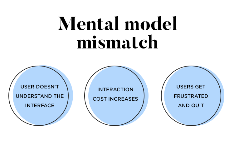
Understanding how the users feel about a certain product can be a big help to developers. This will give them a clear picture of what the users want and expect from the product you’re planning to develop. Therefore, situations such as when your product does not match what users expect can be avoided, preventing several disadvantages, including the most common one: user frustration.

2. Pareto Principle
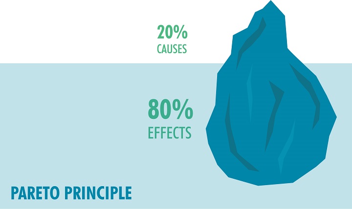
Permalink to "2. Pareto Principle"Pareto Principle is a captivating theory which states that for many outcomes, roughly 80% of consequences come from 20% of the causes. We can refer this law with other names such a 80/20 rule, the law of vital few, or the principle of factor sparsity. This is a principle that suggests to focus most of our time in critical areas that bring the largest benefit. Everything is more efficient this way. Pareto observed this first with a study which showed that approximately 80% of the land in Italy was owned by 20% of the population. It is a theory that we can apply almost everywhere. An example can be Microsoft, who noticed that by fixing the top 20% of the bugs, 8-% of the issues were fixed.

3. Aesthetic Usability Effect
Permalink to "3. Aesthetic Usability Effect"This theory describes a paradox that people tend to find more aesthetic designs as much more intuitive and useable than those that are considered less aesthetic. This leads people to believe that things that look better, will also perform their function and work better. Usability and aesthetics are the most important factors in assessing the overall user experience for a product. Most of the time, users will tolerate minor issues if the design is eye pleasing, this due to the positive emotional response they feel.
Based on the results of the analysis made by Masaaki Kurosu and Kaori Kashimura, researchers at Hitachi in Tokyo, we gather that “the apparent usability is less correlated with the inherent usability compared to the apparent beauty. This suggests that the user may be strongly affected by the aesthetic aspect of the interface even when they try to evaluate the interface in its functional aspects, and it is suggested that the interface designers should strive not only to improve the inherent usability but also brush up the apparent usability or the aesthetic aspect of the interface.” Simply put, this shows that aesthetic–usability effect plays a major role in user experience, considering how much people are drawn to beauty.
4. Consistency
Permalink to "4. Consistency"Consistency is one of the most important principles of UX design. All this because, when users use your product, they expect to share some similarities with other products the use most of the time. This helps them to become familiar with your product faster and easier, without additional learning cost. This makes things easier for both sides: designers and users. Designers, by following this principle, wouldn’t have to invent the wheel every time the work on a new project, and users can expect that similar functions will use similar components for achieving a similar task, meaning that also the results will be similar.
5. Goal-gradient Effect
Permalink to "5. Goal-gradient Effect"Goal-gradient effect is a hypothesis, coined by Clark Leonard Hull, American psychologist, who sought to explain learning and motivation by scientific laws of behavior. His hypothesis states that the closer people get to a reward, they more they speed up they behavior to get to their goal faster. Simply put, people get motivated by how much is left to reach their goal or target, not how far they’ve come. This hypothesis can apply also in laws of design. The closer a customer gets to their goal, the more they get motivated to finish. In order to do so, they should know where the finish is. That’s why, we often see progress bars, profile completion percentages and badges. This is a very good method to be applied anywhere you need to keep your users motivated to keep completing a task.
6. Hick’s Law
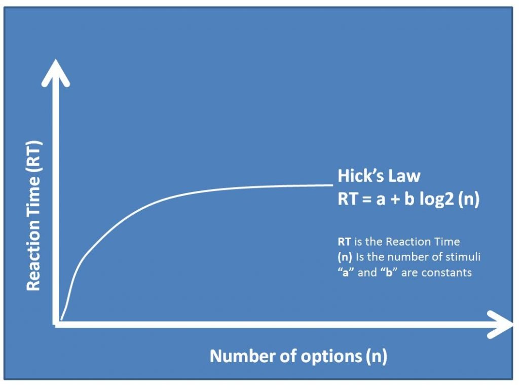
Permalink to "6. Hick’s Law"Hick’s Law suggests that the more choices the user faces, the harder it becomes and the longer it takes them to come to a decision. The idea is that with increasing features and complexity, the usability and performance will decrease. Therefore, Hick’s Law is always a good principle to be applied when you want to rationalize only presenting specific parts of the process at a time on screen and you don’t want to overwhelm your customers with too many choices.

7. Jakob’s Law
Permalink to "7. Jakob’s Law"Jackob’s Law is pretty similar to Consistency. It elaborates the fact that designing familiar experiences are more welcomed than those non familiar. This because, people are accustomed to how some specific things work, therefore it’s requires very little to no thinking or the need to learn from the start. When this law is violated, it often comes to frustration created by unfamiliar experiences and most likely leading to people leaving/not using your product.
8. KISS
Permalink to "8. KISS"KISS is the acronym for Keep It Simple Stupid, indicating that simple design works best, therefore the goals always should be to keep things super simple and avoid unnecessary complexity. Simple designs are also cheaper, easier to implement and maintain.
9. Recognition Over Recall
Permalink to "9. Recognition Over Recall"This theory argues that we should use Recognition Over Recall as our memory is better at recognizing things than recalling them. Let’s take an example to tell the difference between these two. Answering a question such as Did Harper Lee write the book To Kill a Mockingbird? involves recognition, since all you have to do is recognize whether the information is correct or not. Instead, if the question is Who wrote To Kill a Mockingbird? you would use a process of recall to get the right answer from your memory. Now, how is this related to UX design? Well, for example, multiple-choice is easier to answer correctly than a short-answer question. Another example would be to use pictures and icons instead of text, because pictures are easier to recognize, which by the way is similar to the Picture Superiority Effect.
10. Social Proof
Permalink to "10. Social Proof"Social Proof Theory, popularized by psychologist Robert Cialdini, suggests that a person who is not really sure, or does not know what the proper behavior for a certain situation is, can be easily influenced by other’s people choices and tends to imitate them and provide guidance for their behavior and actions, especially if it’s in a large group. For us, these kind of influencers include testimonials, product reviews, expert advise etc. By adding these kind of Social Proof techniques we will increase the likeliness of other people using our product, as they’re more likely to believe in it.
