Flat design vs. Material Design
Flat design
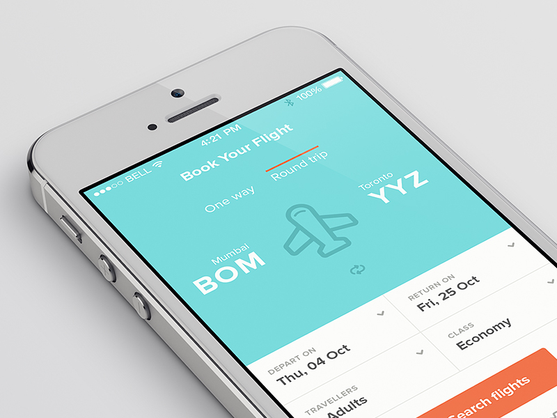
Permalink to "Flat design"Flat Design is a minimalistic approach, a very basic design that appears quite simple and is expressed by using flat iconography, colors and topography. While skeuomorphism is pretty detailed, flat design is the exact opposite - has no details, and has really simplified and faint colors.

Benefits of Flat Design
Permalink to "Benefits of Flat Design"- Clear design, no distractions
- Consistent design, easily adjusted
- Clear topography, very easy to read
- Faster to design
- Speeds up the loading time
Disadvantages of Flat Design
Permalink to "Disadvantages of Flat Design"- Lacks depth
- Limited choice of iconography, color and typography
- Hard to be creative and stand out
- No design guidelines
Material Design
Permalink to "Material Design"Material Design was developed by Google in 2014. This concept is more about philosophy, principles and ideas. Material design is very flexible in comparison to other design trends. It includes three-dimensional features that are made of layers of different physical elements along with saturated colors, deep shadows and smooth animations. The basic principle was to express all the physical properties that are related to a paper, on screen. Often, material design is called semi-flat or flat design 2.0.
Google has extended the use of this design also on Gmail, Google Drive and Youtube, meanwhile others too have started using this design for web designing.

Like Flat Design, Material Design also has its benefits and disadvantages.
Benefits of Material Design:
Permalink to "Benefits of Material Design:"- Easy to interact with and simplistic interface
- Specific guidelines, principles and goals that provide consistency
- Unified interface across all types of devices
- Built-in animations to show users what’s happening on screen
Disadvantages of Material Design:
Permalink to "Disadvantages of Material Design:"- Superfluous elements
- Design valid for Android devices only
- Tied to Google - less room for branding
- Restricts the creativity
- Lack of intuitiveness
Conclusion - Flat Design or Material Design?
Permalink to "Conclusion - Flat Design or Material Design?"In today’s trends of design there’s no such thing as material or flat design. This is because only Google uses pure form of material design in their products, everyone else mixes these two. Both these design systems have their merits and faults and both their principles and goals cross over slightly.
Check the concept of Flat Design vs Material design as pointed out by website designers:
- Flat Design is ideal for users used to digital interaction, while Material Design is a kind of response to user’s actions.
- Material Design compared to Flat Design takes designing a step ahead with its communication ability.
- Both systems use a minimalistic approach, but Material Design has the focus more on matching the real world to the digital world.
- Flat Design doest not use Skeuomorphism, Material Design delicately uses them.
- Flat Design best fits for users with simple requirements, while Material Design offers complex solutions
- Flat Design loads faster and it is easier to develop, but the same thing can’t be said for material design
- Material has introduced physics, while Flat Design keeps things simple
- Material Design is an evolution of Flat Design that develops a design ecosystem by using color and functionality that users can get familiar to across different devices and products
- Material Design system is more powerful than Flat Design system.
You can see the difference between Flat and Material Design system and help yourself by choosing best suited design system for your requirements.